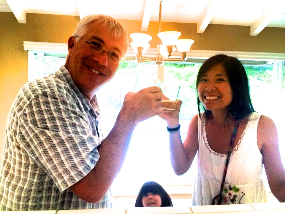
That's us celebrating getting the keys to our new home. I found our house by trolling Redfin.com. I was on my computer and saw the listing the second it was listed. It was a short sale. Less than 48 hours later, the house was taken off the market and they stop showing. We had been searching for more than six months and had not seen anything that checked most of our boxes (and we have MANY boxes), until we saw this one. Our offer was accepted quickly by the owners, but the whole escrow process with the bank was one nervous breakdown after another (first we had to beat out 10 other offers, then we had to watch our future home get put on an online auction because the bank wanted to make sure they are getting the best possible price they could). We eventually pulled through with the help of our extremely competent and professional realtor, Kelly Laule from Better Living Socal and closed the deal. Without our realtor, we would have never gotten this house. From putting in an offer to getting our keys - 4 months.
The 1st order of things for us was to paint the house. I asked Kevin what colors he liked and he said "beige". I gave him a second chance and he said "earth tones" - much better.
I love colors and I love playing with colors. I started pouring through paint color inspirations for a clean, modern but warm feel. I wanted colors that called out to us, nature tones that felt soothing but not boring. I didn't want any strong colors because I knew I would tire of quickly. For weeks, I wake up and go to bed thinking of colors. My Architect friend, Ker How from A Solid Plan who's helped me over the years with design challenges, patiently nurtured my obsession and gave great ideas on how to create the feel I wanted for our home.
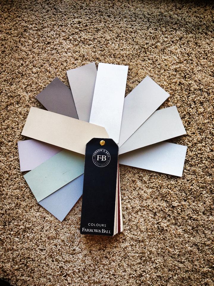
I studied the different types and brands of paints available to us - the low / no VOCs (Volatile Organic Compound), the gloss, satin, eggshell, flat, the clay, acrylics, high and low pigment paints. During my research, I stumbled upon Farrow & Ball paints. Farrow & Ball paints are eco-friendly, low VOCs, highly pigmented and gives a luscious flat, clay finish that cleans up beautifully with just a damp cloth. Their colors worked seamlessly together into the spaces I was trying to create. I ended up picking all the colors for our house from the Farrow & Ball fan deck, loaned to me generously by Cindy from Farrow & Ball at their Costa Mesa Location.
F&B Fan Deck
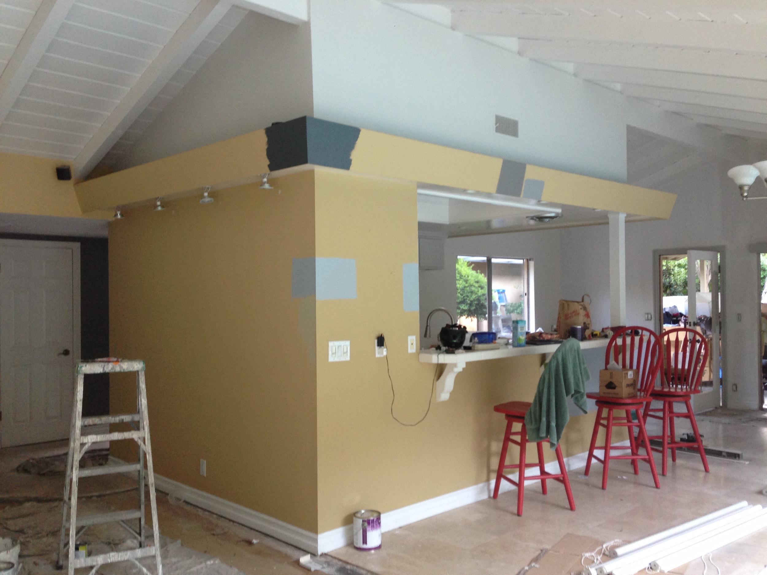
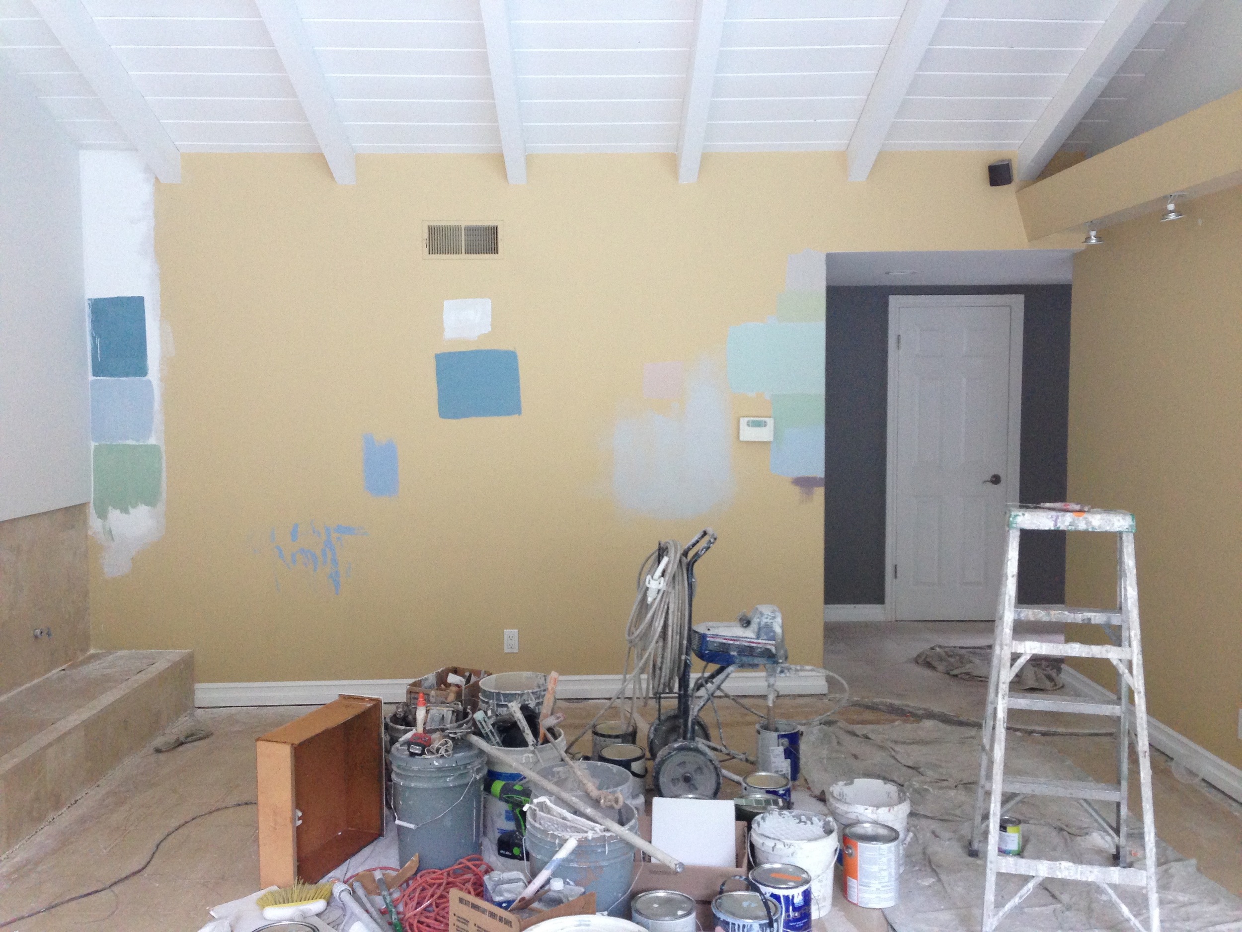
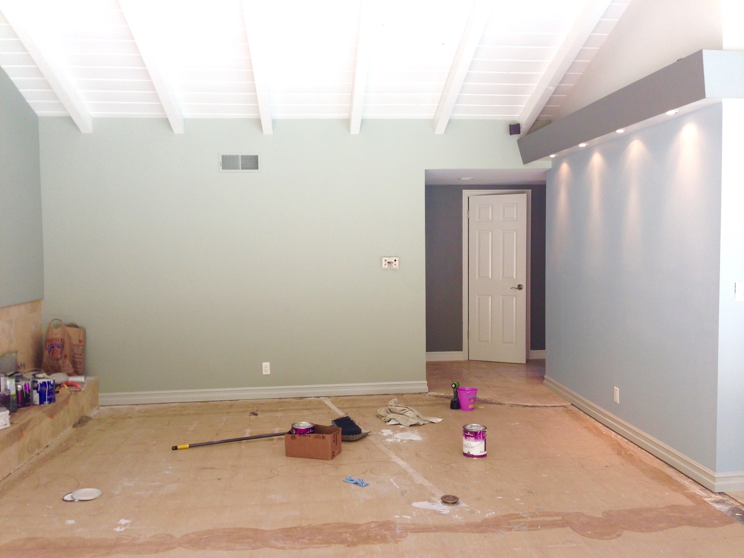
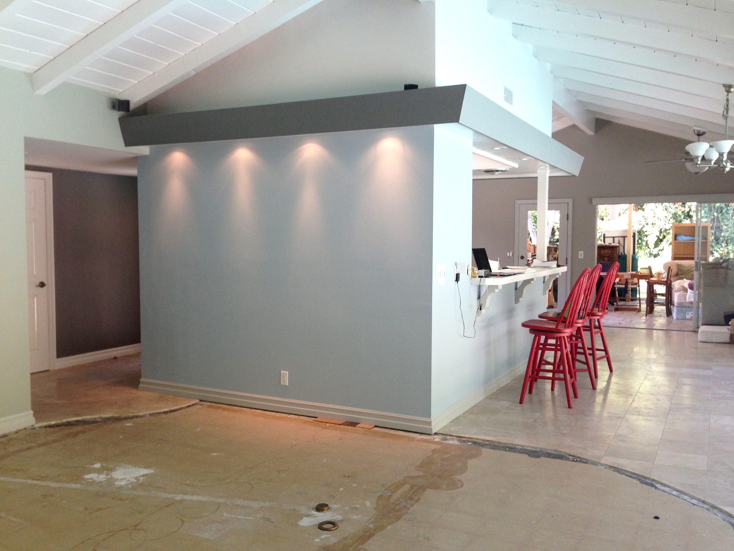
Before
During
I took a long time deciding on a few of the remaining colors. By the time I had decided on the rest of the house, there was no time to place an online order and wait for delivery. I took the fan deck to my local Orange Paint Store and met with the very talented and patient Junior. They use Benjamin Moore paints at their store. I went with the low VOC BM Aura line, which was also a high pigment paint and he helped match the colors from Farrow & Ball as close as he could under my meticulous scrutiny. I love how the colors came out. I really enjoyed using Benjamin Moore paints. But there's an unmistakable, glorious, flat yet chameleon-y softness and depth about Farrow & Ball paints that put them a class above other paints.
Decisions, decisions, decisions. I wanted a dark entry (F&B Mole's Breath) that would transition into a bright and light living space.
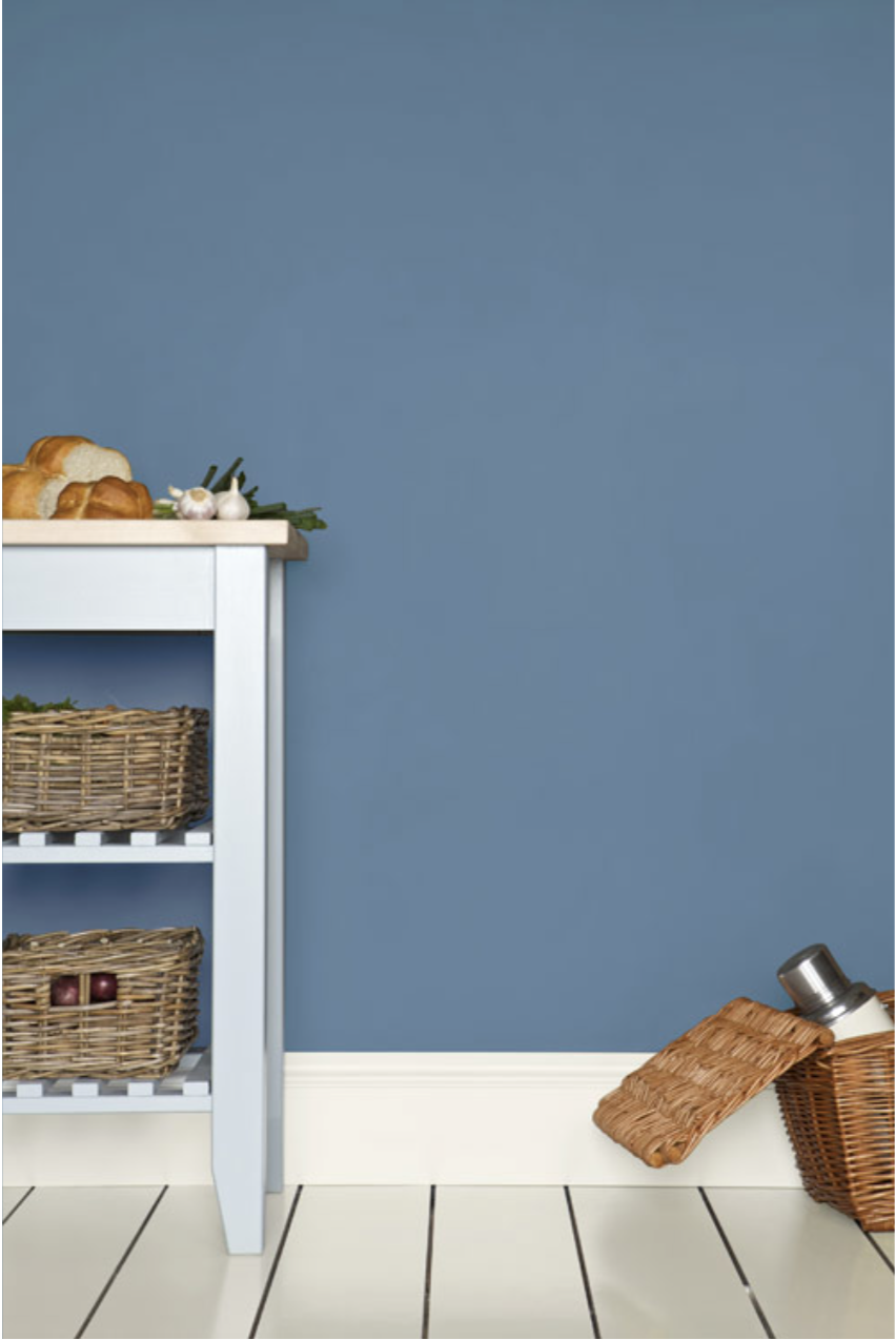
F&B Blue Gray and F&B Parma Gray
The F&B Blue Gray is a slightly cool mix of blue, green and black pigments. It has this magical quality of changing between blue and grey depending on the light conditions and time of day resulting in a very relaxed feel that belongs.
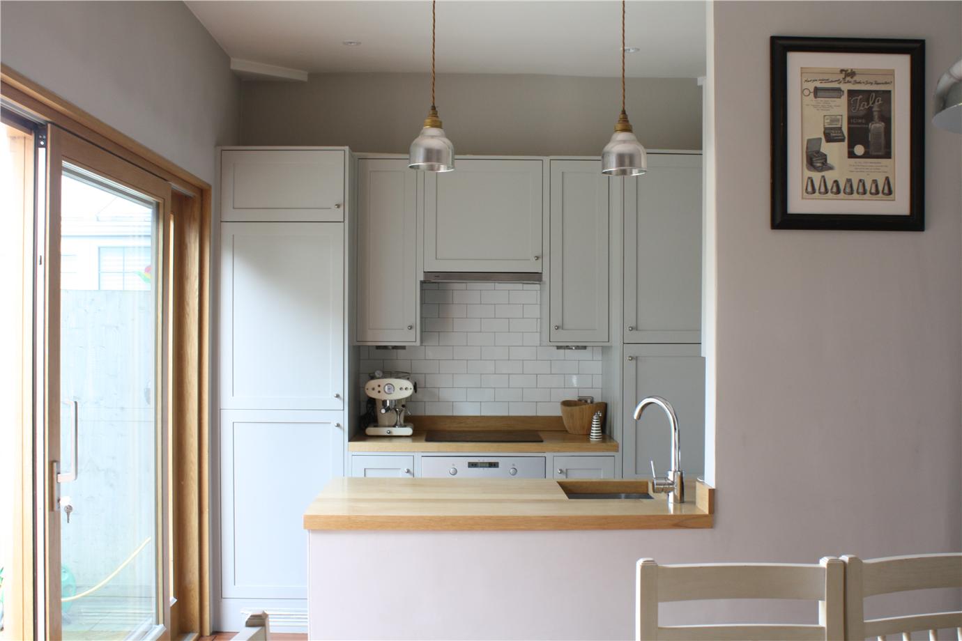
I drew inspirations for our kitchen from these:
image via Houzz
image via Houzz
And decided on this:
Top to Bottom on Kitchen: Farrow & Ball Cornforth White, Mole's Breath, Parma Gray. Far right: Hardwick White Left: Blue Gray
F&B Cornforth White on the kitchen cabinets. It is a beautiful neutral light gray we use it throughout the house. It cleans wonderfully too, much to my surprise, since it is not a gloss finish.
Side Entry F&B Hardwick White at night
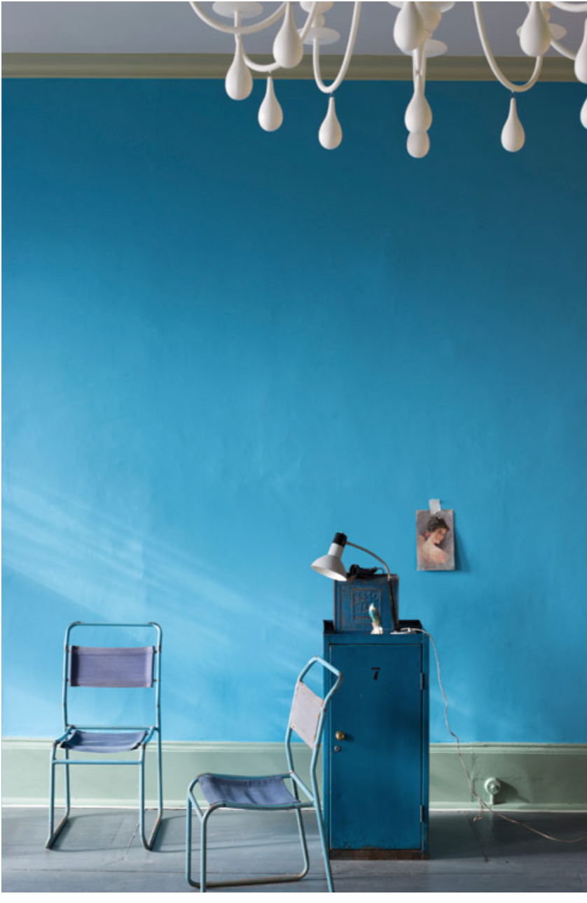
The bathroom was a difficult one for me because it was right by the entry and you can see the wall colors from the front door when you enter. The counter area also has natural skylight coming through and the shower tub area was completely dark. I found my colors for our bathroom when I saw this:
Our hall bathroom F&B Dix Blue & Mouse's Back (in shower tub area)
I kept asking Kyan what color he wanted for his bedroom and he kept picking colors like the really bright St Giles Blue or the super moody Cook's Blue.
And we finally ended up with this:
The lovely and mysterious Parma Gray. Kyan's room has very little natural light and Parma Gray here looks completely different at different times of the day.
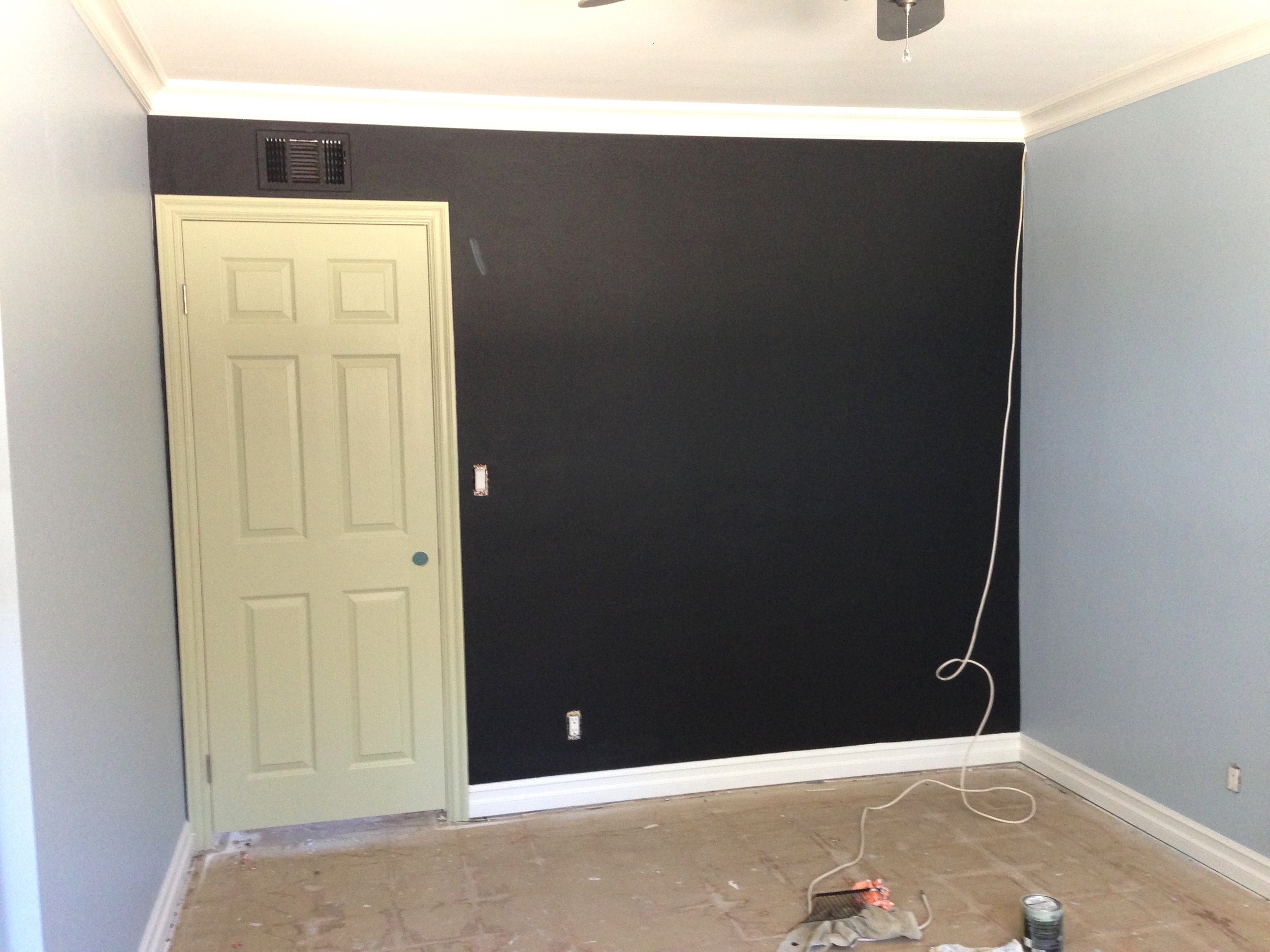
BM Black Chalkboard Paint, F&B Cooking Apple Green Door
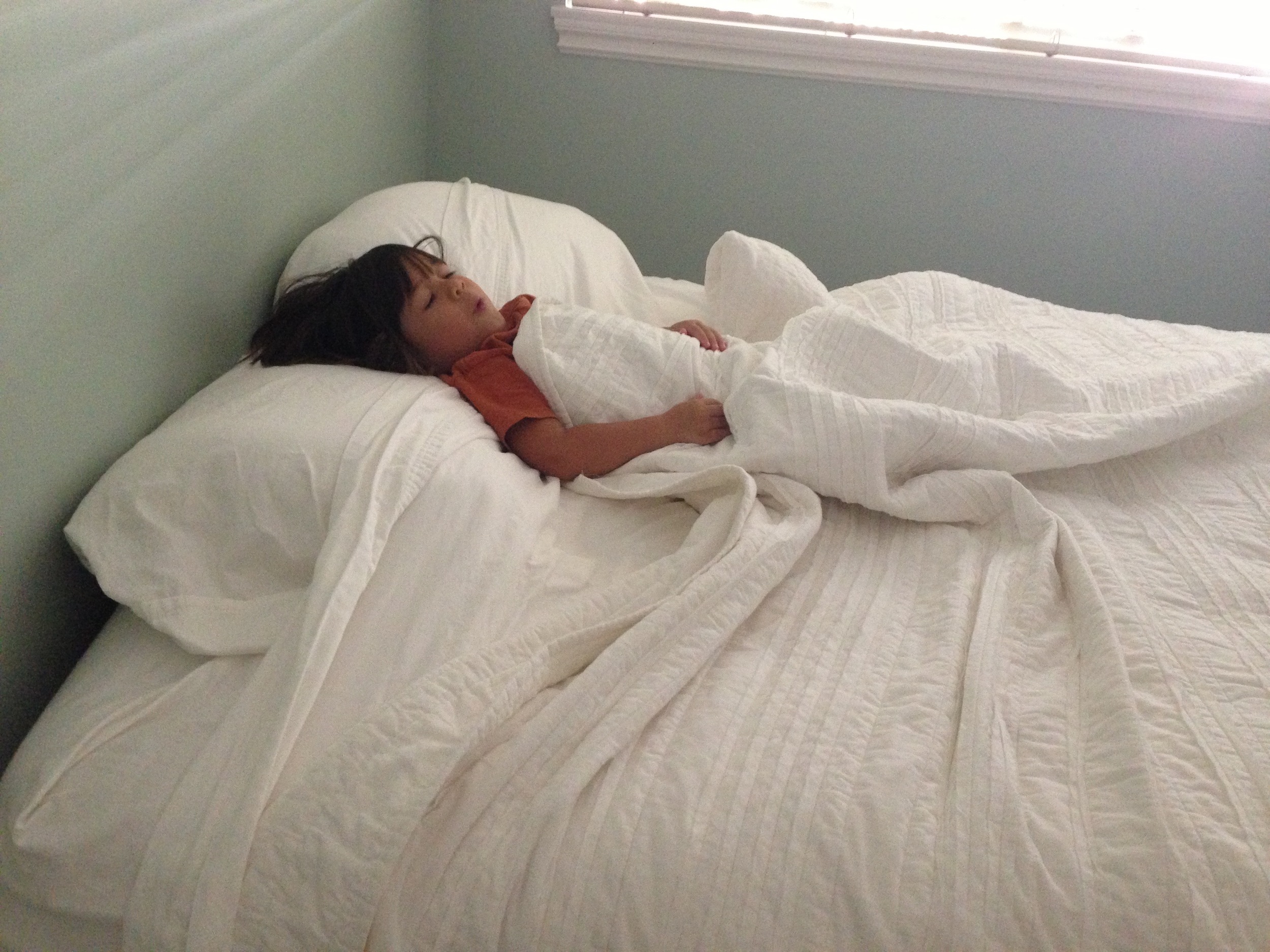
F&B Teresa's Green in Guest Room. Fresh warm green with a blue base. A therapeutic, calming feel but still manage to be cheerful. Also a great choice for children's room.
F&B Charleston Gray (accent wall), has no cool tones and is a dark gray that creates a warm, enveloping and muted room. Paired with F&B Elephant's Breath (Warm Mid Gray with hint of Lavender) for a contemporary and fashionable feel in our Master Bedroom.
I knew I wanted a blue/orange theme for the living area, keeping in mind "earth tones". The whole living area is open and tricky. I pulled the same warm neutral dark gray from the entry into the living area to create interest and to tie in the colors I wanted. I kept trying to add some lavenders and purple tones, which I thought I would really love, but they just feel so melancholic to me. After all the furnishings and accents pieces went in and we finally put up the centerpiece artwork Kevin found at a garage sale years ago, I noticed the uncanny coincidence of how nicely the colors on the artwork complimented the colors I had chosen for our main living area. That really put a smile on my face.
Living Room, F&B Blue Gray & Parma Gray. Entry Mole's Breath
With a child in the house, painting with low/no VOCs is the only way to go. Read here if you want to know why VOCs are harmful. I did not get any headaches and never found myself having to go out for air during the whole painting project. We love the Benjamin Moore Paints we used and will not hesitate to use them again. Farrow & Ball Paints are simply a dream to use, touch and admire. I absolutely love the flat, clay-like finish and the dreamy softness it offers at different times of the day and highly recommend it.
